Project Page Akamai Media LLC Web Performance Report

A clear look at
Ong Optometry's website.

A plain-English review of how ongoptometry.com is working today: what patients experience, how easily new patients find you, and where a few focused changes would make the biggest difference.

Prepared for
Ong Optometry
Website
ongoptometry.com
Site captured
July 13, 2026
Prepared by
Mark Moran
0/100
Needs attention

Overall website health

The foundation is here: a real domain, a working site, and the right basic information. The homepage is thin, though, visibly unfinished in places, and isn't giving Google or new patients enough to work with. These are fixable, high-impact problems, not a rebuild from zero.

Strong Opportunity Needs attention
Watch first

A quick walkthrough of your report

Your site at a glance

Beyond the homepage, here is how the whole site is put together: how many pages it has, how they are grouped, and whether the pages a new patient looks for actually exist.

6pages totalacross 5 areas
2 levelsdeep at mostnothing is hard to reach
4 of 8expected page types present
How your pages are organized
Home1
About1
Services1
Contact1
Patient Forms2
Content a visitor expects to find
About
Contact
Request appointment
Services listed
Individual service pages
Insurance accepted
Pricing
Reviews / testimonials
  • Every page is one or two clicks from the homepage, so nothing important is buried.
  • Services are a single bare list rather than a page per service (dry eye, contacts, exams, kids' vision), which are the pages that would actually rank and answer patient questions.
  • No insurance, pricing, or reviews pages exist anywhere on the site, so patients leave to find those answers elsewhere.

Structure read from the site's XML sitemap on July 13, 2026.

Your nine-point scorecard

Every Akamai web performance report looks at the same nine areas: the things that decide whether a website earns trust, gets found, and turns visitors into patients. Each area is scored out of 100, and together they average to the overall score above. Click any card to read the full explanation of that area.

Does the site look current, trustworthy, and unmistakably yours, or dated and generic? For a healthcare provider, the website is often the first impression, and patients read polish as competence.

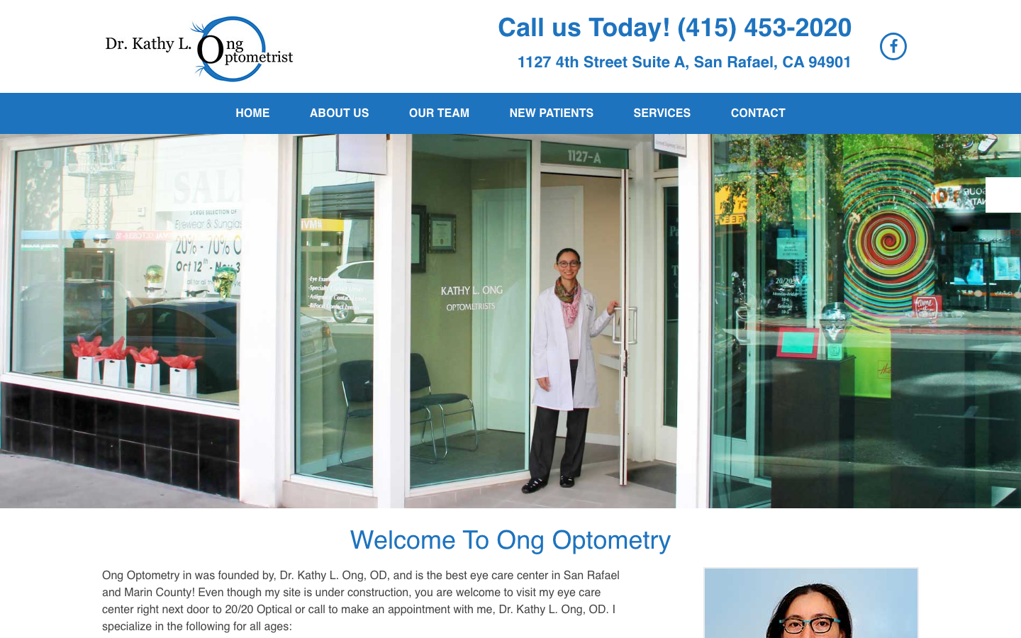
Ong Optometry homepage as it appears today, showing the storefront hero photo and welcome text
ongoptometry.com homepage, captured July 13, 2026.
What a first-time patient meets
1
"Under construction" line still greets every visitor
2
Typo in the opening sentence ("Ong Optometry in was founded")
3
Blank map under the "Get Directions" heading
4
Dated stock template — generic all-blue optometry theme
Working

The essentials are present and human

Your phone number and address sit right at the top, the navigation is clear, and there's a real photo of you and the storefront. That authenticity is an asset, because patients want to see the actual person and place.

Gap

The homepage still says it's "under construction"

The opening paragraph reads: "Even though my site is under construction, you are welcome to visit…" Every visitor sees that line, and on a healthcare site it quietly signals the practice isn't fully tended to.

Gap

A typo in the very first sentence

The first line reads "Ong Optometry in was founded by…". It's a small error, but it's the first thing a new patient reads, and it undercuts an otherwise warm introduction.

Gap

The "Get Directions" area is blank

There's a "Get Directions" heading on the homepage with an empty space where a map should be. A missing map is a small broken window that makes the whole site feel less maintained.

Gap

A generic, dated stock template

The site runs a standard optometry theme (footer credit: "Website by DOCTOR Multimedia"). The all-blue palette, the busy storefront photo used as the hero, and the single-screen layout make it look like hundreds of other practice sites rather than distinctly yours.

Why this matters for your patients

When someone is choosing an eye doctor, they judge care partly by the website. "Under construction," a typo, and a missing map all read as neglect, even when the care itself is excellent. Fixing these is mostly copy and cleanup rather than a rebuild, and the payoff in first impressions is immediate.

Can the right people find you when they search Google for an optometrist in Marin or San Rafael? The basics are set up correctly, so the page just isn't giving Google enough to work with.

How much content Google has to work with
Your homepage
240 words
Practices that rank
~800 words
Thin pages struggle to rank no matter how strong the title is.
Page title Meta description Canonical link Keyword H1 Section headings Image alt text
Working

A strong, local page title

Your homepage title is Optometrist in Marin & San Rafael, CA · Ong Optometry. That's genuinely good, because it names what you do and where, which is exactly what local search rewards. The meta description and canonical link are in place too.

Gap

The main headline is wasted on "Welcome"

A page's top headline (its H1) is one of the strongest signals Google reads. Yours currently says Welcome To Ong Optometry, plus a second, empty headline. Changing it to something like "San Rafael Optometrist & Eye Care, Dr. Kathy Ong" puts your keywords where they count.

Gap

There's very little for Google to read

The homepage has roughly 240 words. Competing practices that rank well usually have detailed service pages for dry eye, contact lenses, exams, and kids' vision, each with real content. Thin pages struggle to rank no matter how good the title is.

Gap

Weak heading structure and a missing image description

The page has only one subheading and it's LET'S STAY CONNECTED, with no keyword-bearing section headings. One of the three images also has no alt text, which affects both search and accessibility.

Why this matters for your patients

When a Marin resident searches "eye exam near me" or "San Rafael optometrist," these signals help decide whether you appear. You've already done the hard part, since the local targeting is right. Adding real service-page content and fixing the headline is what turns a correct setup into actual rankings and new-patient calls.

When someone asks ChatGPT or Google's AI "who's a good optometrist near San Rafael?", can it find, understand, and confidently recommend you? This is the newest frontier in getting found, and most practice websites aren't ready for it.

What an AI assistant can actually tell a patient about you
Can read today
  • Structured data exists (schema.org)
  • Your name and address
Can't find — so won't recommend
  • "Optometrist / LocalBusiness" type
  • Opening hours
  • List of services
  • Ratings and reviews
  • Any FAQ or answerable detail
Working

You already have a data foundation

Behind the scenes, your site outputs structured data (schema.org) describing the site and organization. Many small sites have none at all, so this is a real head start and the plumbing already exists.

Gap

The data doesn't say you're a local optometry practice

The structured data is generic. It describes a "website" and "organization," but there's no specific LocalBusiness or Optometrist type, no opening hours, no list of services, and no ratings in a form AI can read. Those are exactly the details an assistant needs to recommend a healthcare provider.

Gap

There's almost nothing for an AI to quote

With about 240 words and no FAQ or service detail, an AI assistant has little to draw on when asked what you specialize in, which insurance you take, or why patients choose you. It can find your name and address, but not the substance that earns a recommendation.

Why this matters for your patients

A growing share of people now ask an AI assistant for recommendations instead of scrolling Google, and those tools favor businesses with clear, structured, detailed information. Getting this right is a genuine edge, since most optometry sites in Marin haven't done it yet, so there's room to be the practice the AI names first.

Is it immediately clear who you help and why they should choose you? A visitor decides in seconds, so the words on the page have to do a lot of work quickly.

Questions a new patient looks for — answered on the page?
2 of 6covered
Who you are (warm intro)
How to reach you
What each service involves
Insurance you accept
What to expect at a visit
Conditions you treat
Working

A warm, personal voice

You introduce yourself by name and speak directly to the reader, which is exactly right for a solo practice. That personal tone is a genuine strength worth building on.

Gap

There's very little to read

The homepage runs about 200 words total, and the services are a four-item bullet list with no detail on any of them. A patient can't learn what an exam involves, what conditions you treat, or what to expect.

Gap

No insurance information

The page never mentions which insurance plans you accept. For most patients choosing an eye doctor, that's one of the very first questions, and its absence sends them looking elsewhere.

Why this matters for your patients

People book when their questions are answered before they have to ask. Telling them plainly what you treat, which insurance you take, and what makes your care different is what turns a quick visit into a booked appointment.
Can a visitor get from landing on the page to contacting you without friction? Every extra step between interest and booking quietly costs appointments.

The path from landing to booked — where it breaks
Step 1
Lands on the page
Step 2
Finds phone & request buttons
Step 3
Sees where you are — map is blank
Step 4
Books a time — no self-scheduling
Working

The path to contact is short

Your phone number sits at the top of every page, and there are clear "Request Appointment" and "Request a Refill" buttons on the homepage. A motivated patient can reach you quickly.

Gap

The map doesn't display

The homepage has a "Get Directions" area, but the map isn't showing (a common sign of an expired mapping key on older sites). A patient can't see at a glance where you are or how far away.

Gap

Booking is manual

Appointments happen through a request form or a phone call rather than real-time scheduling. Patients increasingly expect to see open times and pick one themselves, day or night.

Why this matters for your patients

A working map and self-service scheduling remove the two most common points where a ready-to-book patient drops off. Letting someone choose a time in the moment they're motivated captures appointments that a callback request often loses.

Are the signals there that tell a first-time visitor you're the real thing? New patients look for proof before they pick up the phone.

Trust signals a new patient scans for
Secure connection
Licensed & credentialed
Real street address
Dates look stale (2020)
No reviews shown
Working

The fundamentals are in place

The site is secure (HTTPS), your credentials as an optometrist are noted, and a real photo plus a street address ground the practice in a real, findable place.

Gap

The site looks untended

The footer copyright still reads 2020. Combined with the "under construction" line, it suggests the site hasn't been touched in years, which makes a visitor wonder what else is out of date.

Gap

Reviews aren't surfaced

Patient reviews are the single most persuasive trust signal for a local healthcare provider, and none are shown on the homepage. Bringing your best Google or Yelp reviews onto the page would do real work.

Why this matters for your patients

Fresh dates, visible reviews, and clear credentials together tell a first-time visitor the practice is active, trusted, and current. These are quick additions that raise confidence right at the moment someone is deciding whether to call.

Can everyone actually use your site, and where are you exposed to compliance risk? Healthcare websites are a frequent target of accessibility lawsuits, so this is worth taking seriously.

Automated accessibility scan — 12 issues found
2 serious
10 moderate
AAAAAA
Web accessibility grade
"AA" is the accessibility grade the law effectively expects a business website to meet. Two serious problems here — a link with no readable text and an untitled embedded frame — keep the site below it. That's the same gap that drives the accessibility complaints and legal demand letters increasingly aimed at small healthcare practices under the Americans with Disabilities Act (ADA).
Working

It isn't starting from zero

The site uses a standard, keyboard-navigable structure, so the foundation for an accessible experience is there to build on.

Gap

An automated scan found 12 issues

A standard accessibility scan flagged 12 problems, 2 of them serious: a link with no readable text and an embedded frame with no title. Both leave screen-reader users guessing.

Gap

Structure and images need work

The scan also found skipped heading levels and page content sitting outside proper landmarks, which make the site harder to navigate assistively. An image is missing its description as well.

Why this matters for your patients

Beyond being the right thing to do for patients with disabilities, these issues are exactly the kind that drive ADA demand letters against small healthcare practices. They're all fixable, and clearing them lowers a real barrier and a real legal risk at the same time.

Does it work and look right on phones and tablets, not just the desktop it was designed on? More than half of local searches now happen on a phone.

On a phone
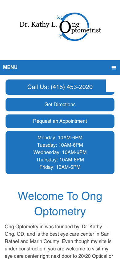
Ong Optometry homepage viewed on a mobile phone screen
ongoptometry.com on a phone-sized screen, captured July 13, 2026.
Fits the screen — proper viewport, no sideways scrolling
1
Small tap targets — several links sit below a comfortable tap size
2
Busy hero — the storefront photo is hard to read at phone size
Working

The essentials adapt to a phone

The template sets a proper mobile viewport and the layout fits the screen with no sideways scrolling. The core information and buttons are all reachable on a phone today.

Gap

A few tap targets are too small

Several links and buttons are smaller than the size that's comfortable to tap, which leads to mis-taps and frustration on a small screen.

Gap

The hero is busy on a small screen

The reflective storefront photo used as the hero is hard to read at phone size and leaves a weak first impression compared with a clean headline and a clear call to action.

Why this matters for your patients

The essentials work on mobile, so this is about refinement rather than rescue. Enlarging the tap targets and simplifying the hero is what makes the site feel considered on a phone rather than merely shrunk to fit.

Does it load fast enough to keep people from leaving before it even appears? Speed is one of the few areas where this site is already in decent shape.

66/100
Opportunity
~1.0sFirst content appears
~1.5sFully loaded on mobile
580KBJavaScript the page loads
Working

It loads reasonably fast

On a mobile connection, the first content appears in about 1 second and the page finishes loading in around 1.5 seconds. That's a solid starting point, and it means visitors aren't waiting on a blank screen.

Gap

It carries more code than it needs

The page loads roughly 580KB of JavaScript from the template and its plugins, which is heavy for such a simple page. Much of it likely isn't used and is the main thing to trim.

Gap

An image is far larger than it displays

At least one small graphic is saved at around 130KB while only displaying at a tiny size, which is a quick compression win.

Why this matters for your patients

Speed is fine today, but the page is carrying weight it doesn't need. Trimming the unused scripts and right-sizing images keeps it fast as you add the real content the other sections call for, rather than slowing down the moment the site grows.

If you do three things

The highest-impact fixes first

You don't have to tackle everything at once. Ranked by impact for effort, here's where to start.

1

Remove the "under construction" line and fix the homepage typo

A ten-minute copy change that immediately stops the site from signaling neglect to every first-time visitor. Highest impact for the least effort.

Effort: minimal · Impact: high
2

Build out real service content and stronger headlines

Give each core service its own page with genuine detail, and rewrite the homepage headline around what you do and where. This is what moves you up in Google for "San Rafael optometrist" searches.

Effort: moderate · Impact: high
3

Add proper local-business and optometry structured data

Extend the site's existing data with your hours, services, and practice details so both Google and AI assistants can find and recommend you with confidence.

Effort: moderate · Impact: growing fast

Want to talk through the findings?

This report walks through all nine areas of your website's performance, with the highest-impact opportunities called out. I'm glad to talk through what would make the biggest difference for Ong Optometry, and where I'd start.

Prepared by Mark Moran · Akamai Media LLC · akamai.media